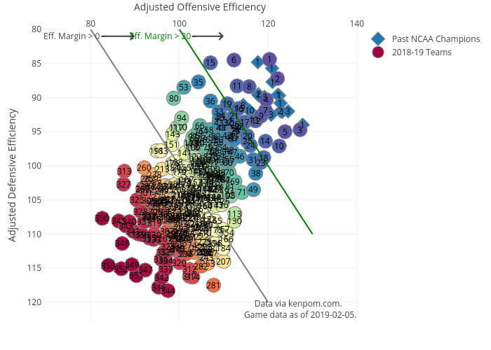
I’ve updated my chart with the latest KenPom rankings AND I’ve now added the past NCAA Champions (2002-2018) as diamonds on the chart. It really stands out now that past champions have always had an efficiency margin of greater than 20 – or to the right of the green line.
In fact, of the 17 champions that KenPom has efficiency data for 10 of them had efficiency margins greater than 30. Looks like Carolina, Kentucky and Tennessee have a little work to do to improve their odds of winning it all this year.
9 of the 17 finished the season as the #1 in efficiency margin and all but 3 finished ranked in the top 3. So good news for UVa., Duke and Gonzaga? Maybe, UVa. also finished last season at #2 in KenPom and well that didn’t turn out so well…
I toyed around with the embedding and WordPress seems to refuse both the iframe and html content for embedding. So please click the image and visit the link for full interactivity.
The Challenges
To add the diamonds onto the chart as a separate ‘trace’ in Plotly I had to move the original bubbles out of the main plotly object and into their own add_trace option. Little did I know that this changes the way the display options are used.
First the color palette was no longer appearing at all. After searching through the Plotly reference I found out that the color palette had to be moved within the marker style options. Okay, great! Except that the option name also changed. In the main plotly object the option is ‘colors.’ In the marker style option it’s ‘color.’ Once I named the option correctly and put in the correct place, I had my rainbow color palette back!
Except… The problem was this applied the colors in the reverse order from what I was expecting – #1 was red and #353 was indigo. Looking through the plotly reference I discovered the marker options ‘cmin’ – to set the minimum value mapped to the colorscale, ‘cmax’ – to set the max value mapped to the colorscale, and ‘reversecale’ – to reverse the order the scale was applied in.
I fiddled around with those options for a solid 20 minutes and a couple of other options and nothing seemed to work. Anything I could find online referred back to those options as the way to fix my problem. Okay, so I was on my own to figure this one out.
Finally, I realized that by moving the colorscale to the marker option, plotly was now applying the color row-by-row starting at the top. And, I’m using the ‘Spectral’ color set from Color Brewer which is the colors of the rainbow. ROYGIV finally entered my brain. It was applying red to the first row at the beginning and going down and through the colors.
I literally face-palmed when it registered that all I had to do was reorder my data frame to have the lowest ranked team first. After 30 minutes of fiddling with options to no avail, it was a simple dplyr::arrange that took about 5 seconds to write and run.
Voila! I had my colorscale applied the way I intended once again.
Next Up: Add a transform to highlight all the schools from one conference at a time. It should be easy to then see the depth and breadth of the conferences.
